About Carbon Reform
Carbon Reform is designing the Carbon Capsule, a modular carbon dioxide capture device that helps eco- and health-conscious building owners reduce CO2 and contaminant levels internally, while saving energy on heating and cooling.
Problem
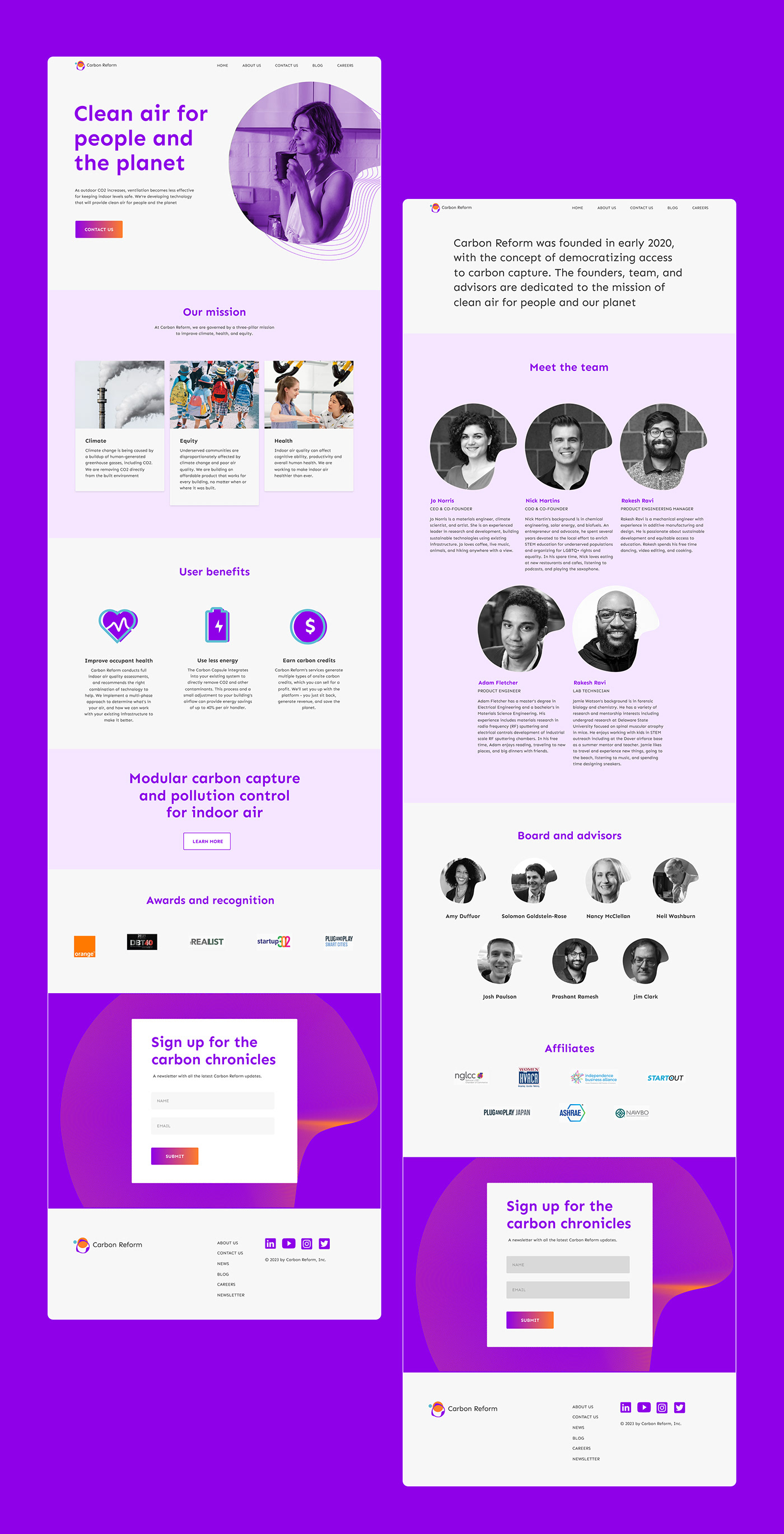
Carbon Reform's visual identity and brand communication lack consistency across major brand touch-points especially social media and website. This has caused difficulty in the customer experience visually. The logo typography is not well balanced with the icon and the several forced text justification on the current website makes it difficult to consume and understand the information there.
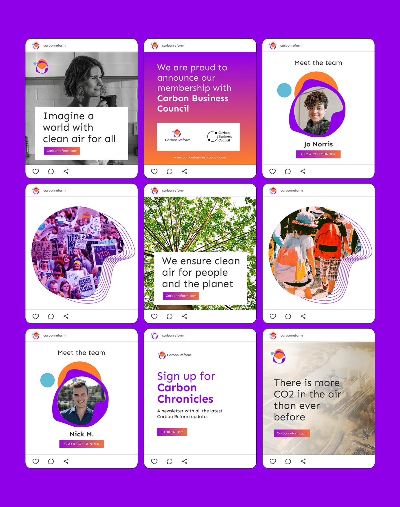
Social media designs have no consistency when it comes to the use of colors, typography, shapes, and image style.
Social media designs have no consistency when it comes to the use of colors, typography, shapes, and image style.
Solution
Even though I retained the current logo icon and colors, I explored several options and concepts from the logo design. I developed shapes and lines from the logo icon and supporting visual elements for the brand. I also explored gradient colors and developed
a brand color pallet from the original logos to avoid the use of colors that do not align with the brand's personality and vision.
I rewrote the homepage copy in simple language so that first-time visitors can grasp the information quickly and take action.
a brand color pallet from the original logos to avoid the use of colors that do not align with the brand's personality and vision.
I rewrote the homepage copy in simple language so that first-time visitors can grasp the information quickly and take action.


The current icons look outdated on the website and do not possess the brand personality.
Here, there is a focus on making sure the icons represent the brand properly and also easy to understand at first sight.